
Learn how to maximize the usefulness of your Adobe Analytics workspace.
Adobe Analytics offers a variety of panel and visualization types, but many analysts tend to stick to the ones they know best. Branching out and exploring other report types can enhance the usefulness of Adobe Analytics and lead to better analyses.
Exploring Adobe Analytics Workspace
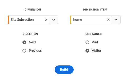
One newer option in Analytics Workspace is the Next or Previous Item panel, which is easy to create. Simply pull in the panel from the left rail and select a dimension and dimension item to analyze. For example, you could see which site subsection visitors went to after the home section by choosing Site Section as your dimension and home as your dimension item.
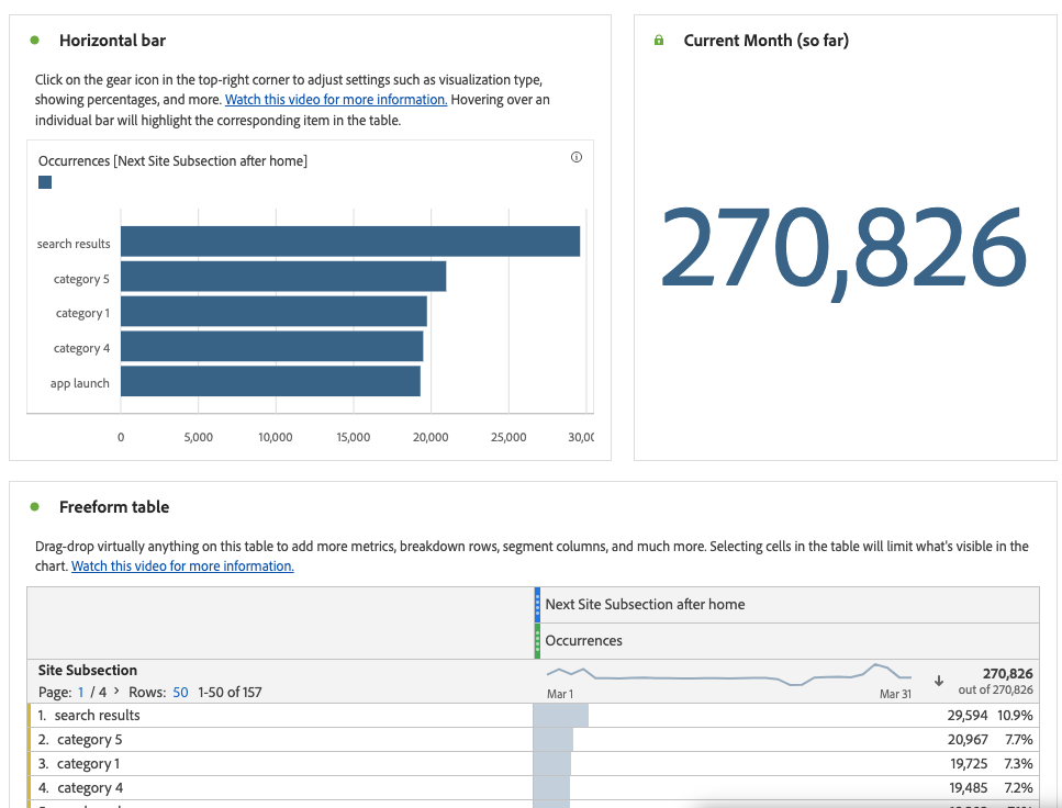
The resulting analysis includes a horizontal bar chart representing the top site sections visitors viewed next, along with a summary number panel indicating the number of visitors analyzed and a freeform table breaking down all subsequent sections by occurrences. Adobe provides helpful text and video resources at this stage for further investigation.
You have the ability to edit various table titles and descriptions based on your desired use case, and additional metrics, segments, and breakdowns are available. For example, you could compare the number of occurrences to unique visitors or break out by device type.
You can also add segments to limit the analysis to specific groups of visitors, such as purchasers or return visitors. The Next or Previous Item panel has a wide variety of use cases, such as limiting the analysis to natural search visits that also had another marketing channel during the same visit.
Comparing the Alternatives
Although Flow diagrams can provide some similar information, the new panel offers more flexibility. Let's say that you're analyzing Facebook users using Marketing Channel Detail and want to see what other platforms or avenues they have used. While a Flow diagram can give some insight, you can't easily break it down by various dimensions. By adding a customer loyalty dimension, for example, you can analyze how various channels are used based upon purchasing behavior of your customers.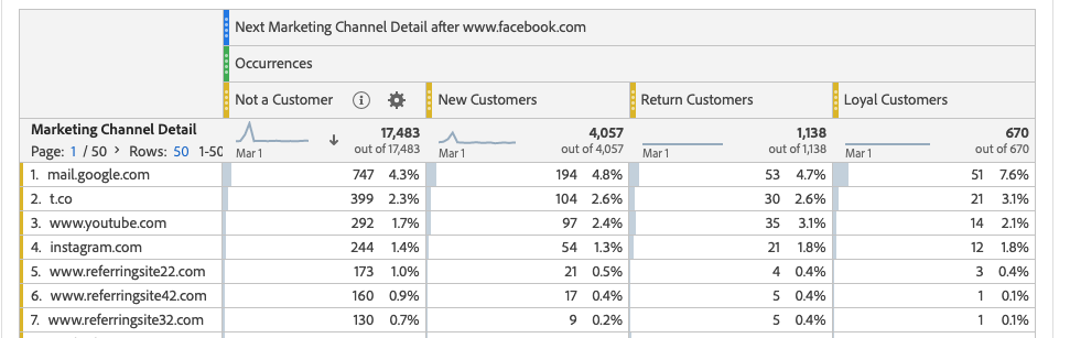
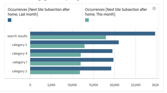
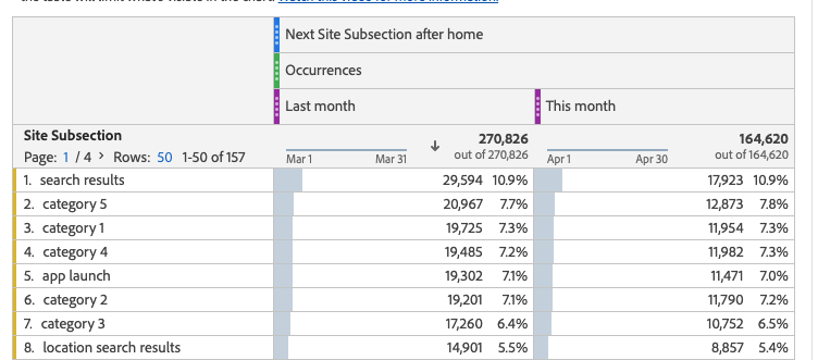
Using date ranges provides another level of insight. Perhaps you'd like to determine if a recent update to your homepage has had the desired effect. By looking at last month compared to this month, you can easily analyze changes in the subsection visited after the homepage.
Once the project effectively answers the business questions, you can share or schedule for dissemination as desired.
Connect with Concord
Concord has a proven track record of helping organizations leverage their analytics data for actionable insights and would be happy to start a conversation about how we can help your organization. Contact us today to find out how we can help your business enable greater resiliency, efficiency, and innovation.
