
Find out the incredible new feature Tableau launched to connect data and manage security.
Tableau 2023.2 is jam-packed with incredible new features for connecting to data and managing security, but my favorite update is a rather unassuming one - the ability to natively generate dashed lines! As a consultant, I want my clients to read their data as easily as possible, and I have received so many requests for one line to be dashed and the other solid on a dual-axis chart, but every time I’ve had to say we can’t do that with the other requirements. This update makes dashed lines incredibly easy to generate, meaning I don’t have to reject those requests any longer!
What’s the Update?
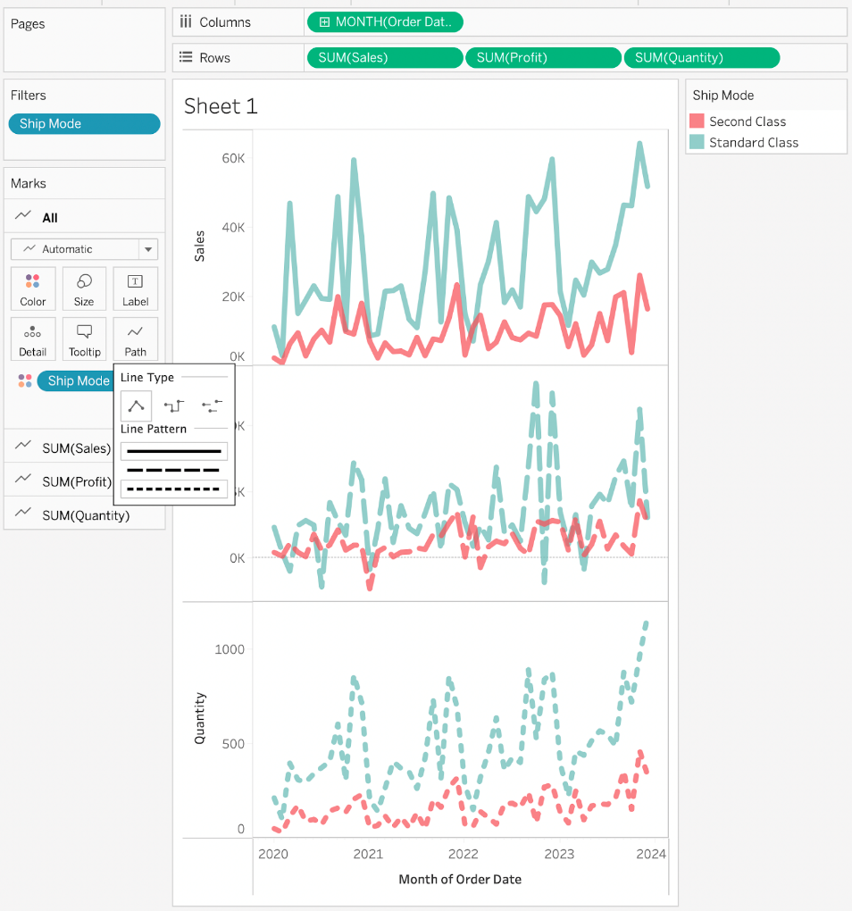
Prior to version 2023.2, your lines could (natively) only be solid. You could update your Path to be Stepped (connected straight lines to look like a staircase) or Jumped (lines don’t connect vertically). While not bad options, they didn’t serve our purposes well; usually, overlaying a standard line over a Stepped just looked cluttered. In this new version, though, you can change a line to one of 3 Line Patterns that apply to all marks using that measure (e.g., a dimension on color will result in several lines all dashed the same way but different colors).
What does this Solve?
For a daily Tableau user, this update is not the most groundbreaking or life-changing. Analysts are never going to complain about more choices, though, and we certainly won’t complain about increased accessibility. We regularly build dual-axis line charts to compare metrics Year over Year or to compare two different metrics against each other. Prior to 2023.2, we had to rely on color as our primary differentiator - this can be a problem, though, especially if you have colorblind analysts or you’re working with a limited palette. Dashed lines provide another way for you to encode your data so that the end users don’t have to rely on only one visual cue to pick up differences in the data.
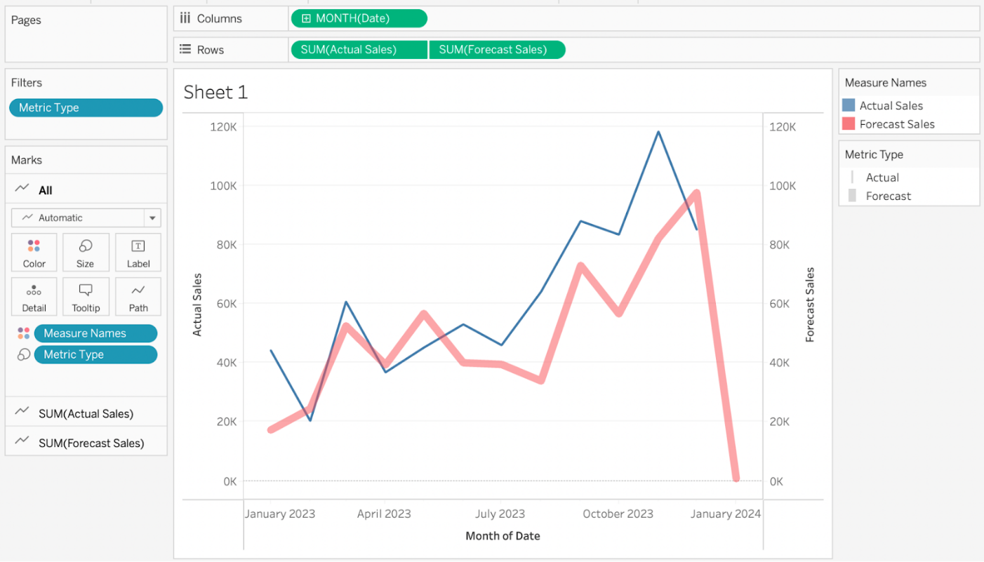
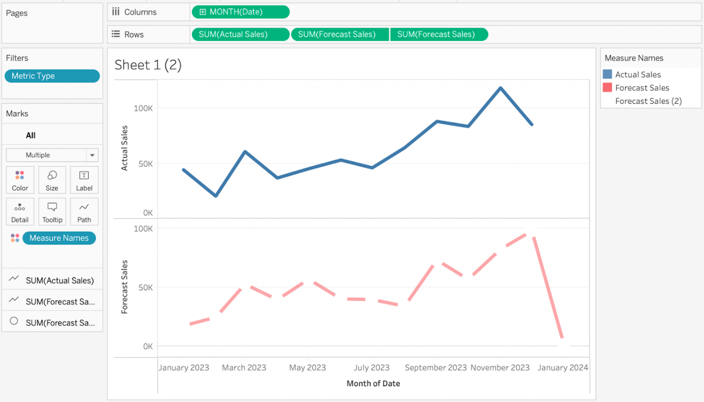
Additionally, this update means analysts can circumvent the ‘traditional’ method of generating a dashed line that uses up the dual-axis feature. You can drag the same metric next to itself on Rows, select Dual-Axis, and change one of the Marks for the metrics from Automatic or Line to Circle, and you’ll get a dashed line. The problem with this method, though, is that you can still only look at one metric at a time - this doesn’t allow for any sort of comparisons with other metrics, and you would often lose your inflection points under the Circle marks so you never truly saw where the peaks and valleys were.
Why is this Important?
This new method of generating dashed lines improves two major components of a dashboard: efficiency and accessibility.
Tableau always performs better when we use a native feature and not a fancy workaround - the tool likes to be used for its intended purposes. Using the native dashed line functionality also improves the performance of the sheet - it literally halves the number of marks and pills necessary to create a dashed line since we don’t have to overlay the data with itself. Most analysts probably won’t see a change in performance unless the dashboard was slower to begin with or the metric you are plotting was incredibly complex, but your server will thank you for decreasing its workload when generating the view.
More impactful, though, is how this update can help improve the accessibility of your data. We’ve done a lot with our clients to encourage them to double-code their data. For example, our clients regularly use the colors Red for last year and Blue for this year. However, if the analyst is colorblind and has to rely on color for that context, then they’re missing out on a huge piece of the story, so we might include a shape indicator in the tooltip or next to the bar or line to double-code that data.
For line charts specifically, we would have to rely on the tooltip most often so that the text from the shape didn’t overlap or make the view messy. Now that we have dashed lines, we can code a metric to use Color AND Path>Line Pattern as indicators. That way, analysts don’t have to rely solely on color to figure out if they’re looking at prior year or current year metrics. This increases data comprehension and reduces time-to-insights for some analysts as they don’t have to hover over a mark to see the tooltip & the year (or metric or forecast) it is referencing.
In conclusion, Tableau 2023.2 introduces a seemingly small but significant update that allows users to natively generate dashed lines. While this may not be a groundbreaking change for daily Tableau users, it offers increased choice and accessibility for analysts working with dual-axis line charts. Previously, analysts had to rely on color as the primary differentiator, which could pose challenges for colorblind users or those working with limited color palettes. The addition of dashed lines provides an alternative visual cue for distinguishing data points and allows for more effective data interpretation. Moreover, this update improves dashboard efficiency by eliminating the need for complex workarounds and reducing confusion, Tableau 2023.2 introduces a seemingly small but significant update that allows users to natively generate dashed lines. While this may not be a groundbreaking change for daily Tableau users, it offers increased choice and accessibility for analysts working with dual-axis line charts. Previously, analysts had to rely on color as the primary differentiator, which could pose challenges for colorblind users or those working with limited color palettes. The addition of dashed lines provides an alternative visual cue for distinguishing data points and allows for more effective data interpretation. Moreover, this update improves dashboard efficiency by eliminating the need for complex workarounds and reducing the workload on the server. By enhancing both efficiency and accessibility, Tableau 2023.2 empowers analysts to convey their data more effectively and make data-driven decisions with greater ease, reducing the workload on the server. By enhancing both efficiency and accessibility, Tableau 2023.2 empowers analysts to convey their data more effectively and make data-driven decisions with greater ease.