Ensuring a Better User Experience with Digital Navigators
Outstanding UX is a competitive advantage in healthcare.
Diagnosing the Situation
When a Fortune 500 Healthcare Company gave their digital properties a check-up, the prognosis wasn't great. Like much of the healthcare industry, the company lagged behind in technology adoption and sophistication and desired more of a retail-like experience.
Matt Gilliss, a Vice President of User Experience & Design at the time, thought the company could create a better experience for its stakeholders, including members, consumers, employees, and healthcare developers.
But it wouldn't be enough to just pull ahead of their healthcare competitors. Instead, the company aspired to match the user experience of top mobile brands.
There was lots of work to create a better user experience across the company's digital and mobile brands. What would be the prescription for success?
Building the Team
It can take a team of specialists to improve the health of patients — and websites. The need for a cross-functional team is especially true in complex situations.
Improving the website would require a deep understanding of the business priorities and the audience mindset — something that the company's knowledgeable marketers could supply in large quantities. There also needs to be significant support from the IT and development teams that managed the current platforms.
But would experts from marketing and IT be enough? The project would ultimately benefit from the addition of Digital Navigators, specialists who live at the intersection of marketing and technology. Fluent in both marketing and technology, Digital Navigators can articulate pros and cons in a way that everyone understands, accelerating the team toward actionable, best-case scenarios.
The Fortune 500 healthcare company agreed and included several Digital Navigators on the cross-functional team, including Matt Gillis on the in-house side, with additional experience and guidance provided by Digital Navigators from Concord.
The Process
Concord's Digital Navigators seamlessly integrated with the internal team and utilized an agile methodology to offer adaptive, rapid delivery and collaboration. Key phases included:
- Align: Using research analysis, the Digital Navigators worked with the delivery team to align goals and objectives for the user experience. They began with company goals and an understanding of the metrics that would drive business value. By clarifying the business value and aligning shared goals and clear metrics for success upfront, the team was able to overcome competing agendas and priorities throughout its projects.
- Define: After defining the goals, Concord collaborated with the team to determine the framework and the roadmap to success. Concord also made sure nothing impeded the team’s plans. For example, when it discovered that the agency-created designs for the member portal were not compatible with legacy systems, they figured out how to make it work.
- Deliver: Using an interactive workflow, the team delivered on expectations for all web projects.
Project Highlights
The team significantly improved user experience across all the deliverables, including a consumer portal, employer portal, digital solutions website, and healthcare developer website.

Member Portal
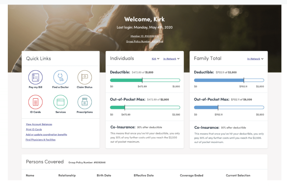
One of the most notable wins is the updated member portal. Featuring an enhanced user interface and leveraging data visualization best practices, the new portal provides a seamless self-service experience.
"When we first started working on the member portal, our satisfaction score was in the 40s. With digital navigators' help, our scores toggled between 79 and low 80s, which is comparable to most retailers. To take healthcare to this level is pretty impressive," said Matt Gilliss.
- Navigation is easier with the help of quick links throughout the page.
- Complex information is simplified through visuals, making concepts like deductibles and out-of-pocket maximums easier to understand.
- Customer support experiences fewer calls after launching new member portal with self-service opportunities.
Consumer Portal
The consumer portal transformed the user experience. The challenge is to maintain the same stellar experience when adding new content to the site. To make it easier for the company to quickly release new content that aligns with the current brand experience, the team created a reusable pattern library which includes:
- Three user interface themes
- Five supported versions
- Twenty-five updated releases
Navigate to a Better Experience
If your company's technology adoption is falling behind your competitors, or you want to take customer experience to the next level, Digital Navigators can help you accelerate your efforts. To learn more, visit www.health.concordusa.com, or download our e-book, Into the Wild: The Modern CMO's Guide to Mapping Digital Strategy to Outcomes.