
Find out our five expert strategies for digital analysts to conquer Adobe Analytics Workspace like never before
Welcome to the realm of digital analysis, where Adobe Analytics Workspace reigns supreme. This dynamic tool empowers analysts to create robust and impactful analyses that unravel the mysteries hidden within data. Brace yourself, as we embark on a thrilling journey through five ingenious methods to conquer Adobe Analytics Workspace like never before.
#1. Embrace the Magic of Existing Visualizations, Tables, and Panels
Unlock the secret to unparalleled productivity by harnessing the power of pre-existing visualizations and panels. With a few strategic moves, you can unleash their full potential, saving time and fostering consistency across projects.
As you work with other collaborators or projects, instead of starting from scratch, you can start with a visualization or table that's already been perfected. Once you've copied it, you can then make any needed adjustments for your current use case.
For example, let's say you've developed and iterated over a table and several reports that trends and analyzes key metrics traffic by device type. Now you've been tasked with performing a similar analysis by site section.
Instead of starting with a blank panel, you can copy the current panel. Once in the copy, you can swap out components as desired. Starting with an existing foundation, you can efficiently customize to meet your current goals.
The gif below demonstrates how easy the process is using sample data from our Analytics sandbox.

#2. Enter the Realm of Dynamic Filters
Prepare to be mesmerized by the enchanting world of dynamic filters. Behold the spellbinding dance of data as it effortlessly comes alive, revealing hidden insights at your fingertips.
Dynamic filters automatically update to reflect dimension items that are present in the data. Any new dimension items that are later added will automatically load in the dropdown selection. Another great feature is that these filters are responsive to other filters that are applied. For example, if you have filters for Marketing Channel and Marketing Channel Details, selecting Email will limit the options in the second filter to just email campaigns.
To use dynamic filters, hold shift as you drop a dimension name onto a panel segment.
Here you can see dynamic filters being added to a project. Note, the shift key was held as each dimension was dropped onto the segment area.

The second demonstration shows dynamic filters in action.

One final example demonstrates using mobile device type, operating system type, and mobile device.

#3. Annotations: Unveiling the Hidden Narratives
Gone are the days of silent data presentations. Unleash the power of annotations to bring context and awareness to your analysis.
Workspace allows the creation and sharing of annotations so they'll appear by default when specified metrics are reported during the impacted timeframe. Optionally, annotations can be used to limit the annotations to a subset of the data. For example, say an outage only impacted the iOS app. By adding the appropriate segment, the annotation would only appear when the metrics were broken out.
By default, annotations are specific to the project where they were created. They can be made available to all of your projects. Additionally, administrators can share annotations with everyone. This helps keep everyone informed of key insights as annotations appear. If desired, annotations can be disabled for certain visualizations or projects.
Adobe's documentation explains how to create annotations and the options available.
Below is an example annotation that can be used to provide important context. 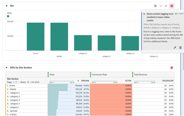
#4. Personalize Your Analytics Wonderland with User Settings
Dive into the dazzling realm of user preferences and customization, where Adobe Analytics Workspace molds itself to suit your every need. Discover the joy of tailored dashboards, customized defaults, and personalized color schemes.
Workspace recently expanded user preferences and added great customization. Depending upon personal and company preferences, a variety of options can be set. Let's say you prefer to turn off grand totals and sparklines to reduce visual clutter on dashboards. Great news! You can now set these options and all future projects and tables you create will be automatically formatted appropriately.
For tables, there's a wide variety of defaults that you can set such as default metric (no more occurrences!), default dimension, and hide cell backgrounds if desired.
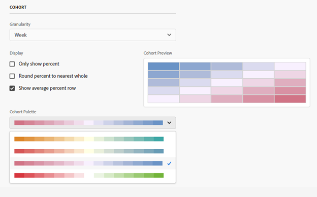
For specific visualization types, many options can also be set as defaults. If you prefer weekly cohort tables and prefer a specific color scheme, that's easy to set.
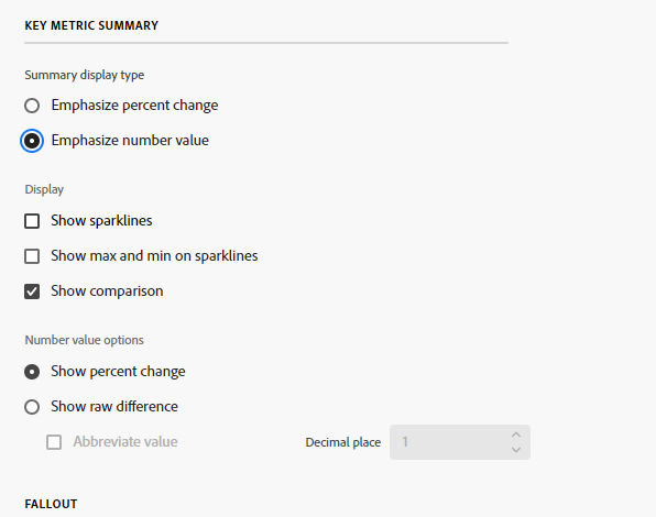
If you want Key Metric Summary to emphasize the number value over the percent change and hide the sparklines, it's simple to do.
Full details can be found in Adobe's documentation.
Once you've updated your defaults to your preferred settings, any new creations will follow suit. As always, you can adjust these on an ad hoc basis as desired.
Given these new options, it's a great opportunity for your analytics team to discuss best practices for some key settings. Where it makes sense, having each analyst use consistent defaults can help reduce mental effort for your stakeholders.
#5. Unleash the Power of Company Reports
In this final act of wizardry, witness the birth of company templates—your gateway to unparalleled productivity freeing your time to conquer new challenges and drive innovation.
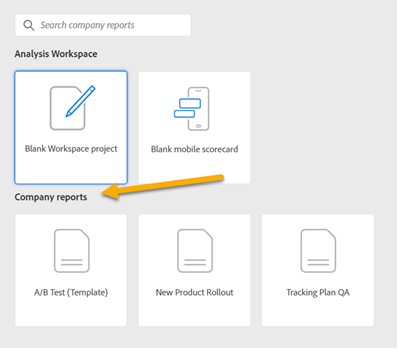
As the analytics team iterates on standards and dashboards, these can be saved as templates, also known as company reports within Workspace. When a Workspace user clicks create, in addition to standard blank workspace options, they'll also see any company reports that have been added. These can be used to set up frequently used freeform tables and visualizations thus allowing newer users to add any desired segments and replace existing metrics as needed.
Use cases may include A/B tests, promotional reports, and new product launches. These company reports provide a quick way for users to get started.
In the realm of digital analysis, time is of the essence. By harnessing the full potential of Adobe Analytics Workspace, you can conquer mountains of data and unlock the secrets within. Explore the five strategies we've uncovered to work smarter, faster, and more efficiently. Which method will you embrace to revolutionize your analytics game?
While you navigate the intricate world of data, at Concord we understand that the road to data harmony can be treacherous. With our wealth of experience and expertise, we have witnessed the perfect fusion of data stacks from clients across the globe. If you seek to conquer the challenges of data integration, we invite you to embark on a conversation with us. Together, let's shape a data-driven future like never before!