
Artificial intelligence (AI) has undoubtedly emerged as the story of the decade.
While we have only scratched the surface regarding ways to leverage artificial intelligence, two companies have been at the forefront of change in their respective industries. Power BI from Microsoft and Tableau from Salesforce stand out as two of the most potent and powerful Business Intelligence tools available in the market today. These tools, although fundamentally different, share similar data visualization capabilities that can be used to derive quality insights and analysis to business leaders worldwide.
In this blog, we will be comparing the AI capabilities of Tableau and Power BI to determine applicable use cases, data accuracy, and limitations within each tools AI functionality. To do so, we will be extrapolating data Baseball Savant and a Superstore Sales practice dataset. Below is a high-level overview of AI features we will be discussing:
- Q&A Viz (Power BI) vs Ask Data (Tableau)
- Smart Narrative Viz (Power BI) vs Data Stories (Tableau)
- Analyze Data (Power BI) vs Explain Data feature (Tableau)
Q&A Viz (Power BI) vs Ask Data (Tableau)
Power BI’s Q&A Viz and Tableau’s Ask Data feature both use AI to transform user generated text prompts into stunning visualizations. Both tools can answer a wide array of natural language questions using the data that is fueling your dashboard.
We put these tools to the test by entering two questions into each tool and comparing the results. Our first question was “Which player had the most doubles in 2022?”. Immediately after typing our query, Power BI analyzes our model and locates the specific field we want to reference. The fields being our identifier (player), metric (doubles), and the dimension we want to filter by (year). After identifying the components of the desired output, Power BI determined the best visual for the query. In this case, a simple KPI viz with the player's name and the sum of all doubles hit by that player in 2022.

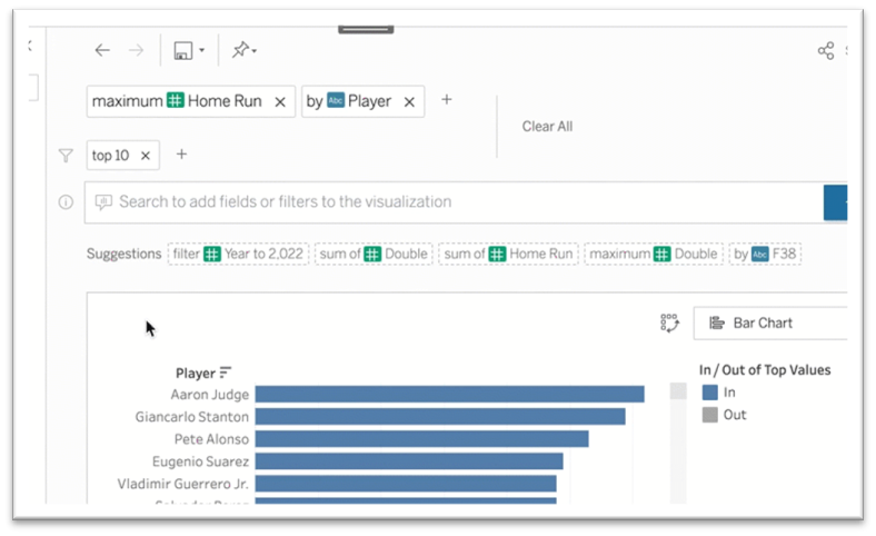
Tableau’s Ask Data feature is up to bat (pun intended). When entering the same prompt, Tableau came up with a different result.
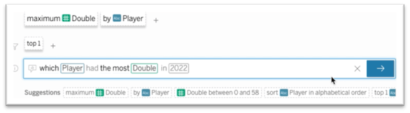
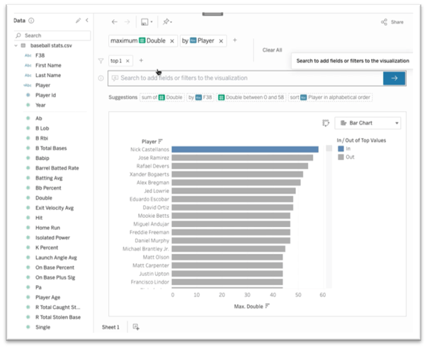
Instead of just providing the name of the top player, Tableau created a bar chart and highlighted the top player. After further investigation I noticed that Tableau incorrectly identified Nick Castellanos as the player with the most double because Tableau failed to filter the data to the year 2022. I tested multiple prompts, asking multiple variations of the question, but each time the year filter was still not included. Fortunately, Ask Data does allow the user to manually add filters and after adding the year filter I ended up with the correct result, Freddie Freeman.
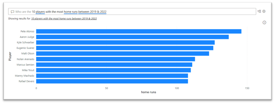
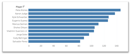
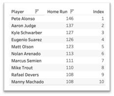
Question number two adds in a little complexity: “Who are the 10 players with the most home runs between 2019 & 2022?”. Like the above example, Power BI identifies the specific fields and metrics we want to use (underlined in blue). However, in this example we give a parameter to only show the top 10 players based on the home run metric. The Q&A visual is smart enough to recognize these parameters and show TOP N for any metric. Since we are asking for multiple players, Power BI generates a bar chart instead of the KPI card used previously. After fact checking against the raw data from the data source, we confirmed that Power BI’s output was correct.
When entering the same prompt into Tableau, Ask Data’s struggles to interpret the date component of the request continued. The highlighted portion of the image below shows Tableau’s interpretation of our request.
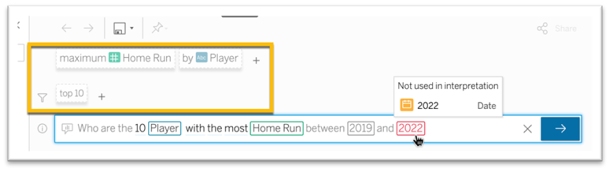
Since there is no date filter in place, we must manually add it in. I also noticed that tableau used a Max aggregation instead of Sum, so I manually adjusted that as well.
After doing so, Tableau is still getting different results as you can see players 6-10 in the Ask Data bar chart are not actually in the Top 10 when looking at the table.
After just asking a few questions using Power BIs Q&A viz and Tableau’s Ask Data, Power BI seems to have a leg up. The Q&A viz did a better job understanding the free text questions we asked without requiring manual intervention. The Q&A viz also proved to provide better results. Round one goes to Power BI.
Smart Narrative Viz (Power BI) vs Data Stories (Tableau)
The Smart Narrative Viz by Power BI and Tableau’s Data Stories takes some of the analytical burden off the shoulders of the end users by using AI to analyze the data on your dashboard, highlighting trends and anomalies.
To compare the two tools, we created identical dashboards in Tableau and Power BI, and then added Smart Narrative and Data Stories to the dashboard to see what insights they came up with.
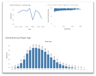
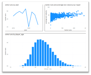
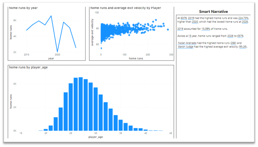
Tableau on the left, Power BI on the right
Immediately I noticed that the two tools are approaching this concept in a very different way. Power BIs solution provides insights for the entire dashboard while Tableau’s solution is specific to the viz type. Shortly after adding Smart Narrative to the canvas, Power BI provided four different insights.
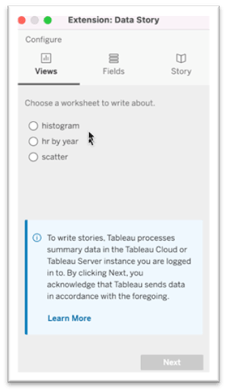
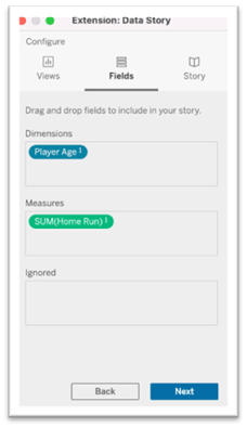
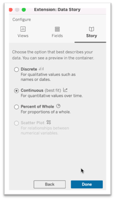
If desired, the end user can add more insights by using a combination of hard coded text and AI driven text. The user can also modify existing insights that were provided by Smart Narrative initially. Tableau’s Data Stories feature requires some up-front configuration before providing insights. The user is asked to select the chart that should be analyzed, define the dimensions and measures, as well as select the type of analysis that should take place.
After configuration was complete, Data Stories populated six insights for the visual we targeted (histogram). Four of the six insights were focused on instances where there was a significant increase or decrease in home runs relative to player age.
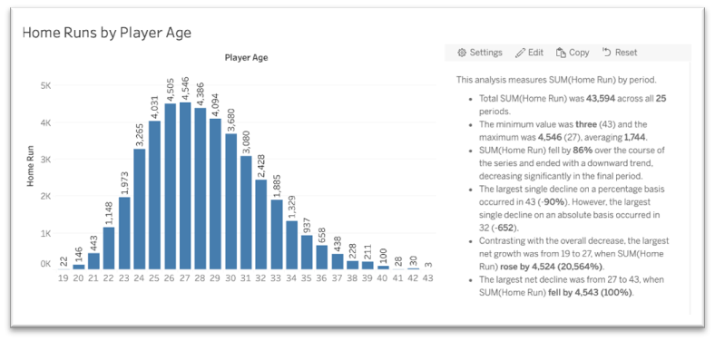
Out of the box, Data Stories uses the calculation of the measure as the measure name. For example, instead of saying ‘home runs,’ we have ‘SUM(Home Run).’ We can change that by clicking on settings and creating a new label for the measure.
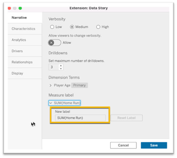
Contrary to Power BI’s Smart Narrative Viz, Data Stories offers a ton of customization. As you can see in the screenshot, there are six different tabs all for additional customization for your Data Stories.
So which tool wins round two? That largely depends on the use case. For users who want an easy-to-use tool that analyzes the entire dashboard to procure insights, Power BI’s Smart Narrative is the better option. For a highly customizable analysis on an individual chart, Tableau’s Data Stories brings more to the plate.
Analyze Data (Power BI) vs Explain Data (Tableau)
Many of the dashboards that we build are designed to help end users identify patterns and trends in their data. Once a pattern or trend is identified, the next question is usually “what is causing this behavior?”. This involves drilling down further into your data either through other visualizations or trying sort through raw data which can be very tedious. In an attempt to take some of this tedious work off your plate, Power BI and Tableau created Analyze Data (Power BI) and Explain Data (Tableau).
Analyze Data (Power BI)
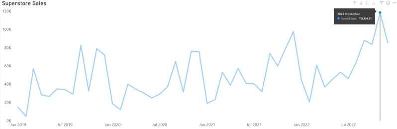
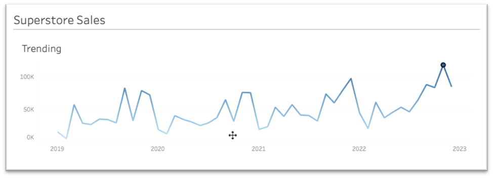
The Power BI line chart below shows sales trending over time leveraging the Sample Superstore dataset. What if we wanted to know why November of 2022 was such a great month in terms of sales? What were the main contributors to this substantial increase?
Analyze Data in Power BI can interpret pre-built visuals to procure insights using AI to help the end user explain fluctuations within the data. In the example below we will use Power BI’s Analyze Data functionality to determine the main contributing factors to the significant increase in sales between October and November of 2022.
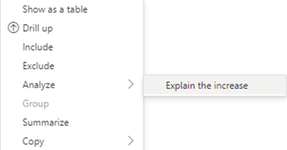
To use the Analyze Data functionality, we first need to right-click on the data point we wish to investigate. Once the data point is selected the following table will appear next to your visual. Go to “Analyze” and select “Explain the increase.” Depending on the data point selected, Power BI gives the user three options to explain the trend: ‘Explain the increase,’ ‘Explain the decrease,’ or ‘Explain the difference.’
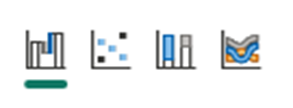
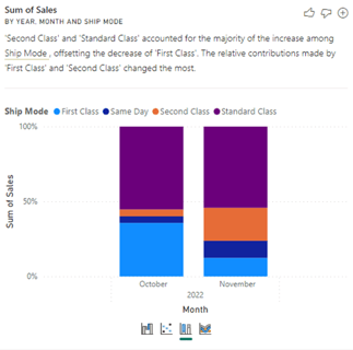
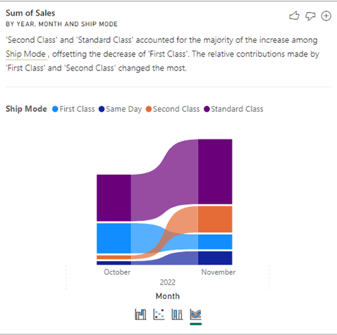
Once ‘Explain the increase’ is selected, Power BI will analyze the data and provide multiple visuals with explanations for the trend. The user can toggle between 4 visualization types: Waterfall, Scatter, 100% Stacked Bar, and Ribbon.
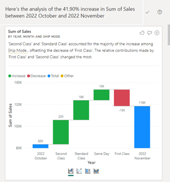
In this first example, Power BI automatically identified Ship Mode as a key driver for the increase in sales between October and November of 2022. Towards the top of each section, Analyze Data explains how this dimension and its more granular components may have driven the data to increase or decrease given all fields within the dataset. It will visualize the trends according to the user selected visual. Each visualization option will show the data in a unique way.
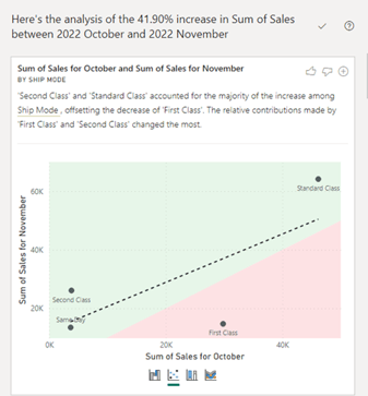
The screenshots above are derived from a single field within Analyze Data. Depending on the number of total fields and the impact those fields have on your data, Power BI will provide between 5 and 10 unique sub-sections/variables to explain the fluctuations in your data.
For our example, Power BI provided us with 9 sub-sections. Each sub-section contains a single variable and will provide the user with the 4 visualizations for each.
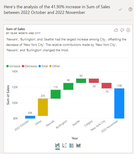
The screenshot above shows a second section and key variable that Power BI identified within the entire dataset. The first section referenced ‘Ship Mode’ as a key factor for the fluctuation, whereas the second referenced the ‘City’ field. Power BI identified the 3 highest increases and 2 highest decreases in sales by city within the entire dataset and explained how these cities may have impacted our results for November 2022.
Explain Data (Tableau)
The Tableau line chart below also shows sales trending over time using the same Sample Superstore dataset. Once again, we want to use the built-in AI functionality to determine why November of 2022 was such a great month in terms of sales. What were the main contributors to this substantial increase?
After selecting the data point to investigate, a dialogue box pops up and one of the options is the “Data Guide” (sign icon).
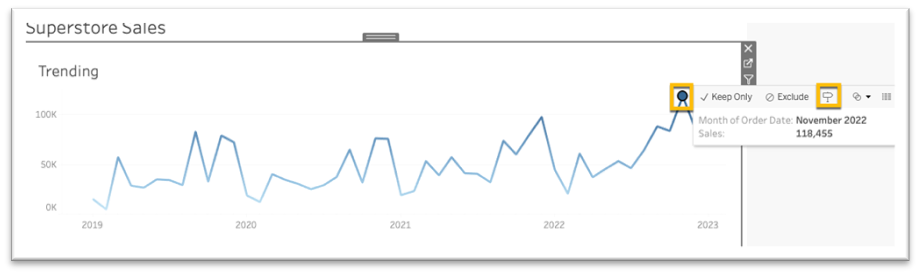
The data guide is filled with features, more than what is in scope for this blog. The portion we will be discussing is the Explanations section. This is where Tableau tries to help us identify what factors are contributing to the data point you selected. In this example, Tableau visualized the top contributing Country and Ship Mode.
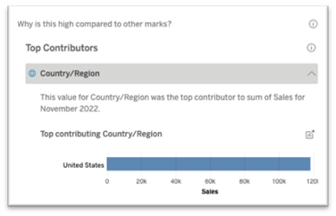
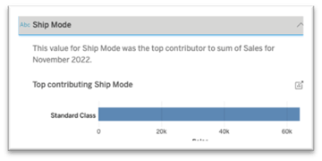
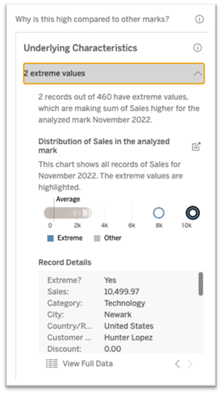
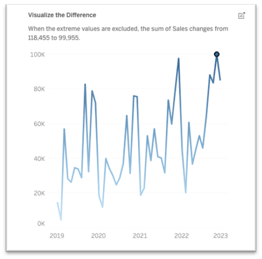
Tableau also identified some extreme values that have an outsized impact on the data. In the screenshot below, you can see that 2 of the 460 records have sales values that are 8k and 10.5k while the next highest is under 3k. Also provided is a trend chart that shows what our data would look like without these outliers.
So, who wins Round 3? In our eyes this was a toss-up. Both tools are relatively easy to use and provide a mix of meaningful and not so meaningful insights. As Tableau and Microsoft continue to advance their AI capabilities, it is safe to assume that the proportion of valuable AI insights they offer compared to those that are not useful will increase.
Who Wins the AI Showdown?
Although we have only scratched the surface of AI capabilities within each of these tools, three things stand out:
- Power BI’s ‘Q&A’ Viz was better suited to answer open-ended questions than Tableau’s ‘Ask Data’ feature. The Q&A feature was easier to use and provided more accurate
- Power BI’s ‘Smart Narrative’ feature provides a mix of high-level and in-depth insights with little configuration needed. Tableau's Data Stories feature is very customizable and provides detailed insights but requires a lot of front-end configuration and is limited to producing insights for an individual worksheet rather than the entire dashboard.
- Both Power BI’s ‘Analyze Data’ Tableau’s ‘Explain Data’ are relatively easy to use and provide a blend of significant insights. There is no clear edge here.
Being so early in the process, it is not surprising that both tools offer AI solutions that can feel a little clunky at times. Currently, it seems Power BI may have a slight edge over Tableau, but both companies have made huge strides in the right direction. The future is bright and neither organization is showing any sign of slowing down their implementation of AI capabilities.
On the Horizon
Microsoft and Salesforce have made it clear that they will continue to improve upon their AI capabilities within their respective platforms.
Microsoft and OpenAI have been partners since 2019. Microsoft first invested $1 Billion in the start-up back in 2019. Since that time, the partners have formed a strong relationship, with OpenAI and ChatGPT being the focal point of Microsoft’s software development over the past year. Microsoft recently integrated ChatGPT into Bing and is beginning to integrate OpenAI’s software throughout their organization, including Microsoft Fabric. Microsoft, with the integration of OpenAI and ChatGPT into Fabric, is looking to improve their natural language processing (NLP) capabilities across all analytics platforms, including Power BI. Microsoft is placing a strong emphasis on integrating Copilot, an AI personal assistant built on ChatGPT, into Fabric. Once generally available, Copilot will enable power users to use conversational language to refine/create narrative summaries, DAX calculations, and even entire reports using generative AI.
On May 9th, 2023, Salesforce and Tableau unveiled their next generation of AI technology with the introduction of Tableau GPT and Tableau Pulse. Tableau GPT will be able to generate visualizations based on natural language prompts using real time data. Tableau Pulse is an AI generated insights tools built on Tableau GPT that will allow the user to surface otherwise hidden insights using natural language and visual formats. Tableau Pulse will be able to read real time data and deliver results instantaneously through Salesforce’s ‘Data Cloud’ platform. Tableau pulse will have integrations within Slack and email to allow interactions and collaboration on the delivered insights. We can expect pilot versions of Tableau GPT and Tableau Pulse to be released later this year.